Did the 2016 Presidential Election Polls Have Significant Errors, or were Americans Just In Denial?

We all remember the watch parties, the calm before the storm, watching the blue states turn red, and suddenly the results were in. They were not as expected, nor as projected. The results of the 2016 presidential election were jarring for some–especially media moguls–and people frantically searched for a reason as to why democracy had failed them, and they found one: the polls. While the polls did generally predict that Hillary would win, were the polls drastically off the mark, or were Americans simply looking for any reason beyond themselves, that Mr. Trump had been elected as POTUS? Unfortunately for some, the latter is most certainly true.

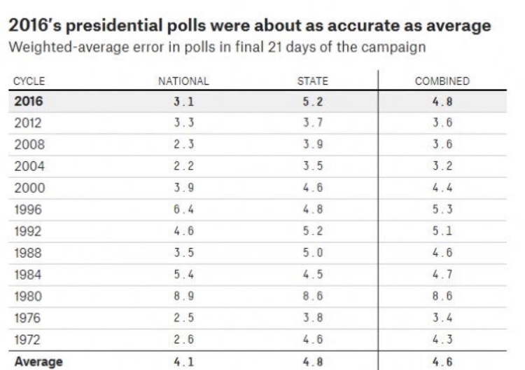
The above graph shows the margin of error of voting in the polls between two candidates of that respective election cycle. Meaning that the polls missed the actual voting margin of Trump and Clinton in 2016 by 3.1 percent–a full point below the national average error in polling (the total average at the bottom of the chart). Per the graph, polls done in the 2004, 2008, and 2012 election were all highly accurate and potentially gave false expectations to those who depended on polls for trending data concerning what was happening throughout the 2016 election, but the results above show that the 2016 polls fared more accurate than the national historical average, and were no reason to sound the alarm.
The accuracy of the polls is further explained in a 2017 report by the American Association for Public Opinion Research, which confirms that the polls were not to blame.

“National polls were among the most accurate in estimating the popular vote since 1936. Collectively, they indicated that Clinton had about a 3 percentage point lead, and they were basically correct; she ultimately won the popular vote by 2 percentage points”.


(Kennedy, et al.)

Although Clinton did secure the popular vote, further polling showed that the electoral college vote was where the upset occurred.


“Eight states with more than a third of the electoral votes needed to win the presidency had polls showing a lead of three points or less (Trende 2016)”.


(Kennedy, et al.)

The RealClearPolitics poll Trende pulled from noted that Clinton had a narrow projected electoral college victory (272-266) and Trump only needed to win a single battle-ground state (one of the eight mentioned in the quote above) to secure the election. Trump’s win notably came from winning in Pennsylvania, Michigan and Wisconsin (all of which were predictably ‘blue states’ prior to the 2016 election) and while the polls were not 100% correct, they were not statistically significant in their margin of error such that Americans could blame the polls for giving them the false hope of having their first female, democratic president.
Although the polls were not remarkably erroneous, there are obvious critiques as to how polling could be improved. From the 2016 election, polling cites did not expect Trump’s overwhelming support in the Midwest, or the Shy Trump Effect (where voters claimed to be a Clinton supporter, but voted for Trump come election day), and a plethora of other variables. Polling can, and most certainly should be, improved to produce better results in the future. However, despite all the uncontrollable variables, the 2016 polls were not to blame for the election results and they were not unreliable. Inevitably, 2016 was a volatile race that was statistically too close to call, but the polls did a pretty damn good job of trying.
All we can do is hope for a better 2020, and let the polls keep polling.


Resources:
Kennedy, Courtney, et al. “An Evaluation of 2016 Election Polls in the U.S.” AAPOR, American Association for Public Opinion Research, http://www.aapor.org/Education-Resources/Reports/An-Evaluation-of-2016-Election-Polls-in-the-U-S.aspx.

Gelman, Andrew, and Julia Azari. “19 Things We Learned from the 2016 Election.” Taylor and Francis Online, Journal of Statistics and Public Policy, http://www.tandfonline.com/doi/full/10.1080/2330443X.2017.1356775.

How should you communicate your data?

In class we went over an example of a poorly prepared data chart that had influenced thinking on the subject for a long time, despite being an inaccurate representation of the data. The chart included economic data that tried to show a causational relationship between the amount of product choices available and the performance of that type of product in the market, but ultimately ended up portraying the data in a way that was misleading. In this case, the data had been generalized and organized poorly, and ended up influencing thinking around that subject, despite being wrong. Eventually, some smart people looked at the chart and realized the data didn’t support the original conclusions. The chart was a bar graph with a poorly designed axis system. This example got me thinking about the ways in which we communicate data, and wondering which methods are more dangerous in misrepresenting relationships between variables. How can we communicate data transparently, so that even if our initial interpretations are invalid, others will be able to spot the mistake sooner?

This question lead me to read this article, entitled “Open letter to journal editors: dynamite plots must die”, which is an opinion piece on the nature of data which I think has some interesting points. The author, Rafael Irizarry, argues that ‘dynamite plots’, or bar graphs and line graphs, commonly mis-represent data by obscuring it. These kinds of plots are useful only in visualizing the summary of a data set, but do not offer any other information. He uses the below charts as an example data set that is comparing diastolic blood pressure for patients on a drug and placebo.

The chart on the left is a simple dynamite plot which actually obscures the data set, and focuses only on the final average. According to Irizarry, “The dynamite plot makes it appear as if there is a clear difference between the two groups,” but “Showing the data reveals more information”. He points out that the chart on the right shows much more information about the data set, including that both cases of extreme blood pressure, high and low, actually are in the treatment group. The chart on the left makes the drug look more reliable and effective than the one on the right, which shows a wildly variable effect within the treatment group. In other words, the dynamite plot is misleading, because it obscures the reality of the data, and makes the relationship appear more stable than it actually is.

Overall, this insight has changed the way I will look at data in the future. Dynamite plots are actually just summaries that can be communicated more easily with just a few words. Giving readers access to the full dataset is the more responsible option, because it allows conclusions to be double checked continuously. I wonder if a more transparent infographic would have had different results in the economic chart I talked about originally? I am having trouble finding that chart again on the internet or class website, but I remember from class that it was a simple bar graph with a poorly organized x-axis. While a simple re-ordering of data entries might have done the same, I believe a more transparent representation of the data would have helped readers and interpreters catch the mistakes of the graph sooner.

Sola Notitia

Yuval Harari ends his 2017 work Homo Deus by laying out a new system of thinking that he calls the “Data Religion”.  At the heart of this religion are two central tenants: 1) that a Dataist out to “maximize data flow” by connecting as many producers and consumers of information as possible and 2) that everything must be “[linked] to the system”, whether it wants to or not (Harari 387).  The greatest sin a Dataist can commit is to prevent data from flowing freely.  This thinking parallels inclusive, non-violent moral and ethical frameworks like Buddhism and Christianity but, rather than acting for the sake of others or for the self, everything is done so that data may enter through all things.  Information, at least according to Harari, doesn’t just want to be free, it must be free.

Harari goes out of his way to illustrate how these principles of data operate in the real world.  According to Harari, it was God or the sacredness of individual liberties that allowed the United States to win the Cold War but rather the fact that the system of state communism in the USSR was not optimized for data flow.  Capitalism, in juxtaposition to state communism, “processes data by “directly connecting producers and consumers to one another” and allows them to communicate freely (Harari 374).   Therefore, free market capitalism is the most “sacred” system of economics (from a Dataist perspective at least).

And this brings me to the actual crux of this piece: I’m not so certain the current state of capitalism is Dataist at all.

In June 2018 the Obama-era regulations protecting net neutrality were removed, meaning that the FCC no longer had the ability to block internet service providers (ISPs) like Verizon or AT&T from putting data behind addition paywalls or throttle service to data that was favorable to the ISP in some way (Collins 2).  This was another step in favor a profit based approach to data.  This isn’t of course to say that the pre-2015 internet was the wild west that it used to be, but the dismantling of the federal legislation protecting net neutrality was another nail in the coffin of completely free moving data on the internet.  Now it would not be out of the question for ISPs to place services like Facebook and Spotify in bundles to be sold to the consumer (not unlike cable television).

A Dataist’s nightmare?  Internet bundles offered by a Portuguese ISP.

The fact of the matter is that capitalism, while connecting producers and consumers of data together freely, is driven by profit.  It’s unfortunate but you simply cannot blame ISPs for wanting to make additional money off a service they operate; it makes logical sense in context.  But this should be considered a grievous sin by any self-respecting Dataist.


So, are there any alternatives?  Is there anyone out there standing up for a Dataist worldview?

“No monopoly should be able to prevent works, tools, or ideas from: being freely used, expressed, exchanged, recombined, or taught; nor to violate individual privacy or human rights.  A creator’s right to be compensated for their work or ideas is only acceptable withing these limitations.” – U.S. Pirate Party platform

Enter the Pirate Party.  Like the Greens or the 4th International, the Pirate Party is an international movement that seeks to reconstruct the global economic system in favor of an open and free flow of information.  They do no seek to dismantle the free market or centralize the regulation of data but neither do they seek to monetize information.  Instead, their aim is to deregulate the flow of information as much as possible.  This includes the abolishment of copyrights, Digital Rights Management, and patents (Party Platform 2).   These changes might seem at odds with a capitalist ethic but I think synchronizes nicely with a Dataist one.

Sola Notitia

Sources Used:

Why are Millennials Blamed for Ruining Everything? The Way we Present Data Matters.

A headline that we’re constantly harassed with from news sources on all sides of the spectrum is this familiar phrase: “Millenials are ruining ______” Fill that in with just about anything, and there’s probably an article existing about it. Millenials are constantly criticized for being a generation of people who ruin things created by the baby boomers and traditionalists. When Google searching “millennials are ruining” and allowing a suggested search, these are the top suggested searches: divorce, the wine industry, brunch, Applebee’s, and even cheese. It’s interesting to inspect the data reflected in these sorts of articles, because although “ruining” reflects a deficit perspective, the data would suggest the things being ruined are probably for the better.

Take, for instance, “millenials are ruining divorce,” the number one suggested search. A Fortune.com article, just one of the first articles to pop up from the search, reads “Having ruined everything from home ownership to the mayonnaise industry, millennials are the process of spoiling yet another major American industry: Divorce. Darned kids. New data from the University of Maryland shows that the divorce rate has fallen 18% from 2008 to 2016, as Generation X and millennials are moving slower when it comes to marriage, Bloomberg reports” (fortune.com). The article goes on to talk about the amount of money that’s annually collected from marriage versus divorce. Another interesting thing to note about this article is that it refers to divorce as an industry. That perfectly represents what this article is really indicative of: rather than the fact that millennials are yet again “ruining” something, it’s more so about the fact that Boomers and the previous generations care more about the profitability of things, even something as emotionally difficult as divorce. The way this data is presented is to put a negative twist on divorce having lower rates, because although it would seemingly be beneficial for society to have a low divorce rate, it’s bad for you guessed it: capitalism and profit, which Boomers seem to care more about. 

Another interesting topic to look at is how millenials are ruining “breastraunts” like Hooters. This is actually supplemental to how they’re ruining other chains, like Applebees and Buffalo Wild Wings, but this one is particularly interesting because of the morality behind it. This is actually from an excerpt of an article from Business Insider called “Millennials are killing list,” where the author writes “People ages 18 to 24 are 19% less likely to search for breasts on the pornographic website Pornhub compared with all other age groups, according to an analysis conducted by the website. For “breastaurants” like Hooters and Twin Peaks, a loss of interest in breasts is bad for business. The number of Hooters locations in the US has dropped by more than 7% from 2012 to 2016, and sales have stagnated, according to industry reports” (businessinsider.com). As someone that trails right behind millennials, therefore is subjected to the byproduct of a lot of their decisions, it doesn’t take a lot of analyzation for me to conclude that the emphasis for them has been moved from “breasts” like the former generation, which is who Hooters was created for, and on to butts (reference: the Kardashians). This is very contrary to that of the generations before them, such as my mother who’s a boomer and frequently comments on how “unbelivable it is” that “your generation” (millennials) like butts so much. That said, it seems that the blame for millennials “ruining” something in this piece is put to blame on our cultural shift from one body part to another. Instead of relying on business to adapt as generations of people change and grow, millennials are left as responsible for ruining everything. Another time where the data is being used to negatively reflect millennials, when according to their economic philosophy, the market should be changing and adapting itself for the consumers if it wants to remain in existence.

So, what’s all of this got to do with data? Well, the data can be used in a few different perspectives. Here, and throughout most of media, it seems like this data about the millennials generation is used to indicate that they’re ruining everything that the boomer’s and previous generations had in place. However, what if there was a perspective shift on this data to think of it as the millennials are changing things for the better? What if instead of “Millennials are Ruining Divorce,” such titles read “Millennials are Crushing Divorce Rates?” From a larger perspective, this example demonstrates how we can manipulate media and use it to create entirely deficit perspectives, or not. The way that we present media matters.
Sources:

Taylor, Kate. “Millennials Are Killing List.” Business Insider, Business Insider, 31 Oct. 2017, http://www.businessinsider.com/millennials-are-killing-list-2017-8.

“The Latest Thing Millennials Are Ruining? Divorce.” Fortune, Fortune, fortune.com/2018/09/25/millennials-ruin-divorce/.

Is Schizophrenia Just an Extreme Personality Type?

Schizophrenia is a largely misunderstood mental illness. For many people, their only experience with this disease is what they see in films. Schizophrenics are often portrayed as violent individuals that abuse drugs and/or alcohol, and had troubled childhoods. The reality is that, in general, these things don’t apply. Individuals with schizophrenia suffer from a long list of cognitive, psychotic, and emotional problems caused by deficits in the brain. Although schizophrenia has been researched for over 100 years there is still a lot that experts don’t understand about the disease. A recent study led by the University of Nottingham in the United Kingdom argues that we are looking at schizophrenia all wrong. Results from the study suggest that schizophrenia may be an extreme personality that exists on a spectrum with healthy personality types.

A previous study found that compared to healthy controls individuals with schizophrenia exhibit a weakened response in the brain to motor visuomotor tasks. The researchers of the Nottingham study wanted to know if this also applied to individuals with schizotypal personality traits. Schizotypy (SPD) is a personality disorder characterized by brief psychotic episodes. Traits of this disorder lie on a spectrum and affect normal healthy individuals to people with full blown SPD. The study was conducted at the University of Nottingham and Cardiff University in Wales. The researchers recruited a total of 166 healthy volunteers from imaging centers on their campuses. The volunteers each filled out a Schizotypal Personality Questionnaire (SPQ) which is a self-reported survey that measures normal to abnormal degrees of schizotypy. Researchers then used Magnetoencephalography (MEG), a technique that measures the magnetic fields generated by neuronal activity of the brain, to look at brainwaves while participants moved their index finger. Correlations between MEG and SPQ results were then computed. The study found a significant negative correlation between the two, suggesting that schizophrenia is on a continuum with schizotypy and is an extreme form with more severe neural deficits.

This study seems very well thought out and the methods were very thorough. The researchers complied to a strict criteria for exclusion of volunteers. The volunteers consisted of both male and females and while there were more females the researchers conducted statistical analysis and determined that the difference was not significant. This was then done to control for sex of the participants. The choice to use MEG to measure brain function seems like a good choice. MEG can measure brain activity extremely fast, unlike EEG it can localize brainwaves, and unlike fMRI it measures direct brain function. The researchers also used a sampling with replacement technique in their data analysis which allowed them to check the reliability of their results.

Even though this study is methodically strong I question the small sample size and issues surrounding the SPQ. Sample size can influence the power of a study to detect the size of an effect. With a small sample size there is an increased risk for a Type II error in which results confirm the hypothesis when in fact the alternative is true. Due to this I would expect to see this study repeated to strengthen the conclusions. I have multiple concerns with the SPQ. While self-reported surveys can help to measure constructs of personality that would otherwise be difficult to measure they come with a multitude of problems. Not only do they rely on the honesty of participants, but not all participants are going to understand or interpret the questions the same. Another concern I have with with the SPQ is how it was conducted. At one site the survey was conducted in-person under the supervision of an experimenter and at the other participants filled it out online before meeting with experimenters. People often behave differently when being watched so could this difference have effected answers? My last concern is the differences in the scales used for the SPQ at the two sites. One site used a 5-point Likert scale while the other used a binary scale. The article does state that participant total scores were normalized using standard deviations and means, however I still wonder how the differences in scale could have influenced how participants answered the survey questions.

Overall I’d say this a fairly strong study, however before I jump on the band wagon I’d like to see this study repeated with more uniform questionnaire practices and a larger sample size. With that said the researchers bring to light a very thought provoking topic on how we view schizophrenia and mental illness as a whole in our society. I think this study does a good job of humanizing people with schizophrenia and showing that they exists on a spectrum of human experience with everyone else and not on another plane entirely. This can go far way in helping to destigmatize mental illness and change the way schizophrenia is portrayed in Hollywood.

Refernces

Liddle, et al. “Attenuated Post-Movement Beta Rebound Associated With Schizotypal Features in Healthy People.” OUP Academic, Oxford University Press, 18 Sept. 2018, academic.oup.com/schizophreniabulletin/advance-article/doi/10.1093/schbul/sby117/5095481.

Lot of Talk, Little Action

In November of 2018, Harvard T. H. Chan School of Public Health released a report on suicide rates and firearms in the State of Utah. The main findings of the report showed that 85% of firearm deaths in Utah were suicides during 2006-2015, firearms account for half of all suicides in the state, and that gun-related homicides were overwhelmingly perpetrated by family members rather than strangers. From this data researchers claimed that lowering access to guns would reduce the number of fatal suicides in Utah without impacting the safety of its citizens. This research was commissioned by and presented to the state legislature, and has temporarily renewed the gun control discussion, but will these discussions progress into action in the stagnant Utah culture?

(Christopher Cherrington | The Salt Lake Tribune)

Representative Steve Eliason (R) proposed a bill in the 2019 General Session entitled Firearm Violence and Suicide Prevention that outlines some possible strategies for preventing suicide based on some information from the Harvard study. Among the items outlined in the bill is a directive for a coordinated effort of the Division of Substance Abuse and Mental Health with the Bureau of Criminal Identification to “implement and manage a firearm safety program and a suicide prevention education course” that would be required for anyone attempting to renew or apply for a concealed-carry permit. According to the Harvard study, suicide prevention “focusing only on those in the hospital for a suicide attempt will miss 90% of suicides,” and since 50% of suicides in Utah in 2016 were firearm deaths, implementing programs at places where guns are bought or when gun owners must renew permits should be a good first step in suicide prevention.

Unfortunately, although Rep. Eliason stated that his bill is “probably the only bill that has the word ‘firearms’ in it that I think we can get a unanimous vote on,” his bill has been stalled in the Rules Committee for months, along with a bill from fellow representative Stephen Handy (R). Handy’s “red flag” proposal would create a list of court orders that would allow individuals deemed in crisis to have any weapons confiscated. The Harvard study does not entirely support this method of harm prevention, stating that “people who died by guns were least likely (6%)… to have been treated for self-harm in the year prior to their suicide death” which implies that there would not be a large percentage of people that would have the opportunity to have their weapons confiscated. However, there is no doubt that Handy’s bill would do more good than harm, as those 6% of people could possibly be helped.

While those two republican-sponsored bills for gun safety are stalled in committees, two other large bills that would loosen gun restrictions have quickly made their way out of committee and through the legislative session. The implications of the Harvard study appear to have been heard by some in the Utah legislation, however it appears that the topic of gun control is still too polarizing to implement any effective legislation at this time. Hopefully the two republican representatives can manage to push their bills through committee and into reality to start the movement toward social change. On the progress of gun control legislation in Utah since the Parkland shooting last year, Rep. Handy said “I think that we’ve done a lot of talking.”

Citations:

House Bill 0017: Firearm Violence and Suicide Prevention

Salt Lake Tribune: One Year After Parkland

Salt Lake Tribune’s report on Harvard study

Harvard’s T.H. Chan School of Public Health Suicide and Firearm Injury in Utah

Are We Voting the Best Way?

The Possibilities of Rank Choice Voting

This weekend the Salt Lake County Democrat Party held a convention to fill the vacancy on the County Council left by new Mayor Jenny Wilson. This was the second such convention held in the first two months of 2019. For those who have not participated in a party convention in Utah before, they follow a predictable and lengthy process. Registration starts early in the morning and is followed by a few hours of speeches, smaller caucus meetings, and the adoption of the rules. Two or three hours into the event, delegates line up to cast their ballot for their top choice to fill whatever office is vacant. That’s when the real waiting starts. Everyone sits and waits for the results of the first rounds of ballots in case they need to be there for a second round. This part can take hours — People start to look frantically at the time, they discreetly slide off stickers of support so that they can check what food other candidates may have brought, and if the thought isn’t spoken aloud, it is clear by the expression on the many faces gathered in the cafeteria of a local school on a Saturday morning: “There must be a faster way to do this.”

It can be difficult to gather voting data in the best way, but one way to make the process faster is to shift away from the Two-Round system and embrace Rank Choice Voting (RVC), or Instant Runoff Voting (IRV). With ranked choice voting, voters can rank as many candidates as they want in order of choice. All the ballots are counted for voter’s first choices, and if no one receives an outright majority the candidate with the fewest first-choice votes is eliminated and voters who liked that candidate best have their ballots counted for their second choice. This process continues until one candidate reached a majority and wins. This blog post will look at RCV, and some research surrounding it, in an attempt to the possibility RCV offers. 

There are two different types of elections in which RCV could be utilized. The first is elections for one candidate into an office. When there is only one winner, like when electing a mayor or governor, RCV could offer a more reflective majority when there are several viable candidates in a race.

The video below simplifies the instants runoff vote using post-it notes. 

The other type of election in which RCV could be utilized is in a multi-winner election, like for a city council election. In this instance, RCV would serve as a form of proportional representation and could help to elect candidates more reflective of the spectrum of voters.

This video explains how the instant runoff vote works for multi-seat elections.

Fair Vote , an organization that actively advocates for the implementation of RCV, compiled a summary of data on RCV through 2013-2014. In this summary, FairVote talks about the Eagleton Polls at Rutgers University, which surveyed a random sample more than 2,400 likely voters. Half of the respondents were in cities holding RCV elections the other half came from “control” cities with similar demographics that were holding traditional non-RVC elections. These polls did a lot in the way of gaining representative data. The survey was sent out by landline and cell phone, it was given in English and Spanish, and the different cities represented had both competitive and non-completive races. One of the questions asked respondents to report whether the candidates criticized each other “a great deal of the time” or “They weren’t doing this at all”. Both surveys found that cities using RCV reported candidates spent little time criticizing opponents compared to cites that did not use RCV. This conclusion makes some logical sense. With RCV it would be inadvisable to pander to a political base because anyone could potentially be the second or third vote that’s needed. This could potentially assist in diminishing the polarization in contentious races.  I think, however, that this data could potentially be more meaningful if the respondent used a semantic differential scale so that respondents would not be forced to express an either/or opinion and leaves room for “some of the time” responses.

Another important finding from the report was that RCV was easy to understnad. FairVote writes, “an overwhelming majority (90%) of respondents in RCV cities found the RCV ballot easy to understand. Similarly, 89 %  of respondents in RCV cities in California found the RCV ballot easy to understand” (FairVote 2014). One of the biggest critiques of RCV is the possibility of confusing the electorate so this finding could offer an incredibly persuasive counter-point. They also found that first-hand experience sustains or improves attitudes toward RCV, even in cities with controversial elections. 

https://fairvote.app.box.com/v/APSA-Civility-Brief-2015

Although, it is a logical conclusion it may be a mistake to assume that experience alone is what resulted in a better attitude toward RCV. This doesn’t take into account awareness campaigns and other things that resulted from the implementation of this voting system that goes beyond experience. The report also fails to acknowledge that from 2012-2014 that views on whether RCV should be used in local elections went down by 4% in RCV cities. I also think it may be an editorialization to call 57% as “vast majority” and “overwhelming support” like they do in the summary. 

RCV offers a compelling alternative to the traditional Two-Round voting system. I believe that the voting system could be improves by better representation, kinder campaigns, and increased functionality. I think it would be interesting to see if respondents attitudes towards RCV has changed since the 2018 elections. I also think it would be valuable to survey candidates and the people in charge of tabulation to gain a holistic view on the functionality of RCV. 

Works Cited:

“MPR News: Instant Runoff Voting Explained.” YouTube, YouTube, 10 May 2009, youtu.be/_5SLQXNpzsk.

“How Instant Runoff Voting Works 2.0: Multiple Winners.” YouTube, YouTube, 21 Oct. 2009, youtu.be/lNxwMdI8OWw.

FairVote. “Ranked Choice Voting in Practice: Candidate Civility in Ranked Choice Elections, 2013 & 2014 Survey Brief”. https://fairvote.app.box.com/v/APSA-Civility-Brief-2015

What Is the Relationship Between Art & Culture/Society?

Often times art is thought of as an entity separate from culture and society; it doesn’t hold the same importance as science, mathematics, or other things that govern how we function as a society. However, art has been a staple of the human experience since we dawned as a species: it served as as a method for discovering how our world works scientifically, and though subtle, impacts how we think of our own culture and how we function as a society today.

Art was a vehicle into understanding the world through science; the Renaissance was an intersection of science and art. Leonardo da Vinci, a commonly known polymath, through seeking to better understand how to paint humans realistically led to groundbreaking studies in anatomy and physiology, “His study of anatomy, originally pursued for his training as an artist, had grown by the 1490s as an independent area of research… By his own count Leonardo dissected 30 corpses in his lifetime.” Da Vinci’s research was an impactful precursor to scientific illustrations and modern biomechanics. Leonardo da Vinci’s experience with drawing anatomy is a small part of larger story, the Renaissance. The Renaissance defined the culture of that period of time, and transformed how society functioned through art, “Renaissance art did not limit itself to simply looking pretty, however. Behind it was an intellectual discipline: perspective was developed, light and shadow were studied, and the human anatomy was pored over – all in pursuit of a new realism and desire to capture the beauty of the world as it really was.” The Renaissance was “a coming together of art, science, and philosophy.” Art led to a bigger passion to understand the world through science, and it questioned how to capture the real world as we perceived it in art. To do that, artists were required to study light and it’s effect on objects, how light and perspective creates three dimensional objects and how to translate that to a two dimensional form, the proportion and musculature of the human body and how if it’s depicted incorrect, humans look strange. Art essentially changed how society (a structure that provides an organization for a group of people in a region) functioned, by shifting it from a world that understood and organized itself through religion, to one that understood and organized itself through science.

Culture “refers to the set of beliefs, practices, learned behavior and moral values that are passed on, from one generation to another… It is something that differentiates one society from the other.” Art, just as beliefs, learned behaviors, moral values are succinctly distinct from culture to culture; each culture defines what those individual values are and the importance in their own culture, and those same values are ever-changing as time passes. Art is directly tied to culture, and it preserves what it felt like to exist in a particular time. Think of American culture in the 80s: the AIDS crisis, President Reagan, the first space shuttle, the rise of computer technology. Those who lived in this period most likely had other things come to mind referring to the culture of the time as well: Andy Warhol, Keith Haring, music from Madonna, Michael Jackson, Whitney Houston, the 2nd and 3rd installment of the Star Wars trilogy, The Breakfast Club, etc. Art (and more accessible and diffused: entertainment/media) is synonymous with culture in a certain period of time, and it gives humans a common experience to rely on to recall what it was like to live during that period.

Art is necessary for more reasons that human expression. It isn’t something we can sever from our lives, it’s entwined with culture and society. It has a symbiotic relationship with culture and society: art gave a spark to the scientific revolution, and is a medium in which humans remember the past.

Works Cited:

Heydenreich, Ludwig. “Leornardo da Vinci – Italian Artist, Engineer, Scientist.” Encycopedia Britannica, 19 Feb. 2019, https://www.britannica.com/biography/Leonardo-da-Vinci/Anatomical-studies-and-drawings

“The Renaissance – Why It Changed the World.” The Telegraph, 6 Oct. 2015, https://www.telegraph.co.uk/art/london-culture/renaissance-changed-the-world/

S, Surbhi. “Difference Between Culture and Society.” Key Differences, 31 Mar. 2016, https://keydifferences.com/difference-between-culture-and-society.html

Should K-12 students’ test scores determine their teachers’ pay?

Success in teaching is notoriously difficult to evaluate. The Bill and Melinda Gates Foundation, who funded the three-year Measures of Effective Teaching Project, cites that “[t]wo-thirds of American teachers feel that traditional evaluations don’t accurately capture the full picture of what they do in the classroom” (Bill & Melinda Gates Foundation, n.d.). Berk (2005) suggests using a combination of “student ratings, peer ratings, and self-evaluation… [to] build on the strengths of all sources, while compensating for the weaknesses in any single source” (p. 48). Despite complications in measuring teaching success, the debate around merit pay (also known as performance pay) for educators has existed intermittently since the 1920s (Pham, Nguyen, & Springer, 2017). In the age of standardization, proponents advocate for teachers’ salaries to be based on their students’ test scores or for financial incentives for favorable results. Writing for Forbes, Nick Morrison (2013) acknowledges the lack of evidence linking merit pay with increases in test scores yet takes the neoliberal stance and calls the system “fairer.” Since then, Pham, Nguyen, and Springer (2017) conducted a meta-analysis of 40 merit pay studies to find that “the presence of a merit pay program is associated with a modest, statistically significant, positive effect on student test scores” (p. 2). While the authors are appropriately conservative in their conclusion, the overly broad range of studies included in their meta-analysis prevents their findings from depicting a realistic account of merit pay’s effectiveness in the US should it be implemented nationally.

The researchers narrowed the original database gathering of nearly 20,000 results to a manageable 40, but the range of locations represented in the data complicates their generalizability. Though affiliated with the American Vanderbilt University, the investigators included twelve studies from outside the nation in their meta-analysis. Within these twelve is an unspecified number from developing countries (Pham, Nguyen, & Springer, 2017, p. 20), data that may have questionable applicability to the United States. Furthermore, out of the 28 US-based studies, sixteen were categorized as “merit pay + other,” meaning that “merit pay was implemented in conjunction with other reforms such as additional training” (p. 43). Because merit pay was not an isolated variable in these studies, their findings are not necessarily representative of its effects. Returning to the issue of inconsistency in data origins, only one other study in the meta-analysis fell into this category, making the US results even more skewed.

Also obscuring the meta-analysis findings is the breadth of methods used in the 40 studies. The authors acknowledge that “most studies reported effect sizes at multiple time points, with multiple estimation techniques, for different subject areas, and at different levels of analysis” (Pham, Nguyen, & Springer, 2017, p. 15). While they report accounting for this using a random-effects model, which “allows the true effect size to vary across studies” (p. 15), this substantial variation is still not ideal. As they note, “studies included in the analysis are decidedly different[,] and poorly produced studies may inject considerable bias” (p. 18). Considering that “almost [fewer than!] half of the studies are peer-reviewed publications” (p. 20), this broad of a sampling seems overly generous. For example, the authors mention excluding “case studies of fewer than five teachers” (p. 13) from their meta-analysis. This implies that they used a sample size of five teachers as the threshold for inclusion, which appears to be true according to the lower bound of 323 students in the total sample size range (p. 43) (if the 323 study did in fact only involve five teachers, there would be a student-to-teacher ratio of 64.6—a reasonable possibility assuming that, for instance, each teacher has three classes of 21-23 students). Although the upper bound of sample sizes of the studies included in the meta-analysis is 8,561,194 students, also using as small a sample size as five teachers makes the inclusion criteria seem too lenient. The excessively broad range of data included in this meta-analysis impairs the overall reliability of the findings instead of adding merit to the studies’ generalizability.

Although Pham, Nguyen, and Springer (2017) present the findings of this meta-analysis in an appropriately conservative way, investigation of their data collection reveals a lack of integrity that prevents them from even concluding a “modest, statistically significant, positive effect on student test scores” (p. 2) associated with merit pay programs. The inconsistency in the data’s locations, quality, and methods is a structural flaw in the meta-analysis that invalidates the researchers’ claims.

References

Berk, R. A. (2005). Survey of 12 strategies to measure teaching effectiveness. International Journal of Teaching and Learning in Higher Education, 17(1), 48-62. Retrieved from http://www.isetl.org/ijtlhe/pdf/IJTLHE8.pdf

Bill & Melinda Gates Foundation. (n.d.). Measures of Effective Teaching (MET) Project. Retrieved from http://k12education.gatesfoundation.org/blog/measures-of-effective-teaching-met-project/

Morrison, N. (2013, November 26). Merit pay for teachers is only fair. Forbes. Retrieved from https://www.forbes.com/sites/nickmorrison/2013/11/26/merit-pay-for-teachers-is-only-fair/#7f3b6164215d

Pham, L. D., Nguyen, T. D., & Springer, M. G. (2017). Teacher merit pay and student test scores: A meta-analysis. Retrieved from https://pdfs.semanticscholar.org/6d88/33216d5a96a46a3fced5af4ffac7d5d29077.pdf?_ga=2.257686413.705186148.1550997599-2007298045.1550997599

Would a Sugar-Sweetened Beverage Tax Overall Reduce the Consumption of Sugar-Sweetened Beverages?

The American Journal of Public Health recently published a study about the effects of sugar-sweetened beverage tax in Berkeley, Oakland, and San Francisco, California. The study targeted two neighborhoods in each of these three cities with the highest amount of African American and Hispanic residents according to the 2010 Census data (Lee et al.). The study mostly looked at the Berkeley neighborhoods and used the others for comparison. The results between the Berkeley group and the comparison group are significantly different. Based on this study, would a sugar-sweetened beverage tax overall reduce the consumption of sugar-sweetened beverages?

In a cross-sectional design, this study looked at sugar-sweetened beverage consumption rates in demographically diverse neighborhoods before the sugar-sweetened beverage tax and three years after. The study was done by having data collectors stand near “heavily foot-trafficked” intersections and adults filling out a fifteen question survey that asked how many times a day a person drank sugar-sweetened beverages, and the results were converted to frequencies. Results showed a decrease in consumed sugar-sweetened beverages by 52.5% in Berkeley, however the study states that “there were no significant consumption changes in the comparison group” (Lee et al.). So while the questionnaires being answered by adults  in Berkeley were decreasing their sugar-sweetened beverage consumption and increasing their water intake significantly, other neighborhoods in different cities that experienced the same tax, did not see as a significant change in reducing consumption of sugar-sweetened beverages.

The study done used excellent data collecting techniques by using cross-sectional questions repeated from 2014 to 2017, so they had a lot of information and data to process. In the article it states that pretax consumption was compared to  an average of post tax consumption, and checked for robustness in unweighted models and modified-inverse probability weighted models. They also used results in the Berkley study and compared it to Mexico’s tax on sugar-sweetened beverages. The results in Mexico’s tax showed the tax affected lower SES households than higher SES households. The Berkeley study used this example from Mexico to use as evidence in concluding lower income households could be more responsive to the tax. Lower income households have disproportionate rates of cardiometabolic disease which are affected by intake of sugar-sweetened beverages. That is not to say high income people do not have cardiometabolic diseases, but are generally more educated and have better access to healthy options, therefore reducing the rates of such diseases.

The study concludes persistent declines of consumed sugar-sweetened beverages as a result of the tax could significantly reduce obesity and affiliated diseases, especially in populations with high initial sugar-sweetened beverage consumption. The study targeted neighborhoods with high diversity populations, but never clearly connected those neighborhoods with lower SES status. Although the study inferred that the tax would affect lower income households and a more diverse population more, the study never explained that the two are connected. They Berkeley study discussed implications should be to implement the tax in other places because consumed sugar-sweetened beverages lowered by half of beverages consumed daily of=ver three years. However, these results were only seen in the Berkeley neighborhoods, and not in the compared neighborhoods.The broader implications suggest that the tax would lower obesity and cardiometabolic disease rates in other areas, especially low SES areas, and that the tax an effective policy option to increase public health.

This conclusion, no matter how robust the study is, continues to be problematic. The study demonstrates success in Berkeley, but failure in other cities. No changes in the comparison group with the same demographic surveyed and  the same tax should not suggest a success, or continuing policy change. The study suggests that a sugar-sweetened beverage tax is an effective way to improve public health, relating to obesity. Consumption of sugar beverages may decrease in lower income households, but that would not increase the public health of higher income households who might not be affected by the tax because they can afford to drink sugar-sweetened beverages with physical income, and better healthcare. Discussions also only accounted for adults, and according to the CDC, obesity  by sugar-sweetened beverage consumption affects young adolescents more than adults. The Berkeley study does not demonstrate effective results in the change of sugar-sweetened beverages relating to the decrease of sugar-sweetened beverages consumed in larger areas.

References:

“Sugar Sweetened Beverage Intake”. Centers For Disease Control And Prevention, 2019, https://www.cdc.gov/nutrition/data-statistics/sugar-sweetened-beverages-intake.html.

Lee, Matthew M. et al. “Sugar-Sweetened Beverage Consumption 3 Years After The Berkeley, California, Sugar-Sweetened Beverage Tax”. American Journal Of Public Health, 2019, pp. e1-e3. American Public Health Association, doi:10.2105/ajph.2019.304971. Accessed 24 Feb 2019.