The CDC and Conceptualizing Gun Violence

Over the past decade gun violence has amplified in frequency, press coverage,  and egregious outcomes in the United States. The news has been filled with stories about mass shootings- Sandy Hook, Aurora, Orlando, Sutherland Spring, Las Vegas, Parkland, Thousand Oaks, Squirrel Hill, and many more. There are even more stories about gun-related suicide deaths, gun-related homicide with in the home, and gun-related injuries. Still it can be difficult to disentangle the misinformation and lack of understand that surrounds the gun violence epidemic. One reason this issue exists is because of the difficulty the United States Government, specifically the Center for Disease Control and Prevention, has had gathering data on gun violence. In this blog post I will look at the CDC in an attempt to understand ways we can improve our understanding of the gun violence epidemic. 

The Center for Disease Control and Prevention is a federal agency that researches the health, preparation, and prevention in the United States to create national strategies to improve public wellbeing. Many people think about the CDC in terms of the diseases and conditions it studies, but the CDC also conducts research on motor vehicle injuries, prescription drug overdoses, child abuse, sexual violence, and more. Unfortunately, for years the CDC was unable to advocate for gun control as a result of the Dicky Amendment. This amendment was created in response to a study published in the New England Journal of Medicine that concluded gun ownership was a risk factor for homicide in the home. The amendment allowed the CDC to study gun violence, but took a away the vast majority of funding for that research. Although many of these restriction were removed from the CDC in 2018, I believe that the Dickey Amendment was and continues to be a significant contributing factor to the misinformation and lack of understanding that surrounds gun violence. 

What’s worse still is that the information the CDC can provide about the gun violence may be fundamentally flawed. First, the CDC is only recording the number of gun-related injuries and deaths in 40 states, the District of Columbia, and Puerto Rico in their NVDRS database, which means that a little over 19% of the country is unaccounted for. It’s difficult to gain a pervasive understanding of gun-related injuries and deaths in the United States when 19% of the data that should be gathered is missing. 

As a result of increasing funding restrictions, the CDC had been decreasing their sampling pool. In 2017 the CDC only gathered data from 66 hospitals according to a meta-analysis conducted by FiveThirtyEight and the Trace. A sampling pool that small has the potential to drastically skew a dataset. What if one hospital treats more gun wounds than is standard? Or less? How are we supposed to determine a standard for the country based off of 60 hospitals? This is reflected in the data reported from 2017. That year the CDC reported that somewhere between 31,000 and 236,000 people were injured by guns, which is four times wider then what they reported in 2001. 

https://fivethirtyeight.com/features/the-cdc-is-publishing-unreliable-data-on-gun-injuries-people-are-using-it-anyway/

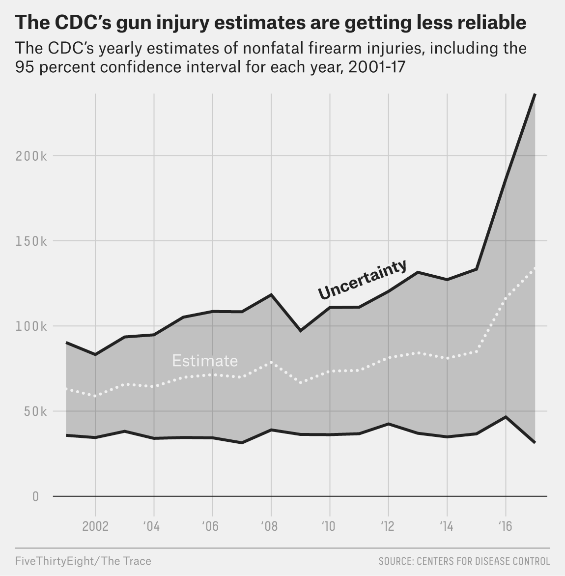
The graph above highlights the level of uncertainty from the coefficient of variation (a measurement of the standard error) from 2001 to 2017. The coefficient variable rose from 22.1 percent to 39.1 percent over that time. According to the CDC a national estimate should be considered unstable and potentially unreliable if the coefficient variable exceeds 30 percent, so 39.1 seems to reflect the precariousness and failing of the CDC’s sampling. 

The impact of this unreliable reporting from the CDC is far-reaching. The data collected by the CDC is used by researchers, journalists, reporters, professors, and lawmakers. There is a lot of opportunity for that data to be warped before it reaches the general public. As a country we need to obtain a better understanding of the gun violence epidemic we face, and we can not do that without reliable data to guide our political actions.

References:

About CDC 24-7 | About | CDC. (n.d.). Retrieved from https://www.cdc.gov/about/default.htmCameron, C. (2018, March 20). Gun Violence:

Cameron, C. (2018, March 20). Gun Violence: Why the CDC Doesn’t Study It. https://www.healthline.com/health-news/why-cdc-isnt-studying-gun-violence#10

Kellermann, Arthur L., et al. “Gun ownership as a risk factor for homicide in the home.” New England Journal of Medicine329.15 (1993): 1084-1091.

Campbell, S., & Nass, D. (2019, March 29). 11 Senators Want To Know Why The CDC’s Gun Injury Estimates Are Unreliable. Retrieved from https://fivethirtyeight.com/features/11-senators-want-to-know-why-the-cdcs-gun-injury-estimates-are-unreliable/

The CDC’s Gun Injury Data Is Becoming Even More Unreliable. (2019, March 11). Retrieved from https://www.thetrace.org/2019/03/cdc-nonfatal-gun-injuries-update/

Campbell, S., Nass, D., & Nguyen, M. (2018, October 04). The CDC Is Publishing Unreliable Data On Gun Injuries. People Are Using It Anyway. Retrieved from https://fivethirtyeight.com/features/the-cdc-is-publishing-unreliable-data-on-gun-injuries-people-are-using-it-anyway/

Definitions for Nonfatal Injury Reports | Nonfatal Injury Reports Help Menu | WISQARS | Injury Center | CDC. (n.d.). Retrieved from https://www.cdc.gov/injury/wisqars/nonfatal_help/definitions_nonfatal.html#advancedstatistics

What Can We Learn From the Data of Disaster Relief?

A few days ago I was listening to podcast that briefly mentioned the inequalities of disaster relief. The podcast made me remember how I felt two years ago reading about the slow response and lack of funding for Hurricane Maria in Puerto Rico compared to Hurricane Harvey. I remember talking to my father about the injustice of the situation. However, I never really thought about how disaster relief might reinforce inequalities within smaller communities. I never considered the disparities between homeowners and renters, hourly wage earners and salaried employees, or how disasters affect people of different races in different ways.

I started searching the internet for more information, and I found a sociological research article called “Damages Done: The Longitudinal Impacts on Natural Hazards on Wealth Inequality in the United States” written by Junia Howell and James R. Elliot. This research article examined damage data and concluded “that natural hazard damages and how relief is provided afterward exacerbate the growing gap between white and black wealth” (Howell and Elliot). In this blog post, I will take a closer look at the work of Junia Howell and James R. Elliot in an attempt to gain a better understanding of what our country can learn from the data of disaster relief.

The rapid effects of climate change have resulted in record breaking storms all over the United States. In “Damages Done: The Longitudinal Impacts on Natural Hazards on Wealth Inequality in the United States” Howell and Elliot found that as local hazard damages increase, wealth inequality also increases. The researchers talk about how the majority of research conducted on natural hazards are qualitative and utilize a case study approach. In this study, the researchers instead used a qualitative approach. They developed a longitudinal population-centered study approach linking a sample of adults in the United States to information on local damages attributed directly to natural hazards. The researchers then examined the ways race, education, and homeownership interacted with the effects of local hazzard damage.

The approach the researchers used required them to track and cross compare data on the wealth of nearly 3,500 families, county-level natural hazard damages, FEMA aid, neighborhood socioeconomic factors, and county size for every U.S. county from 1999 to 2013. They used data from a geocoded Panel Study of Income Dynamics (PSID), Spatial Hazard Events and Losses Database for the United States, FEMA, and data from the U.S. Census Bureau.

The use of secondary data required the researchers to make minor adjustments so that the data would better fit their model – like adjusting for inflation and adjusting wealth upward by the global minimum to ensure that there wasn’t any negative values. The researchers also decided to limit their sample to all adult females (one per household) “present in the PSID from 1999 to 2013 who participated in at least four of the seven interview waves”. In the past I have been concerned that the use of secondary data offeres the potential for a researcher to be biased in their interpretation. Researchers have the discretion to decide what is “relevant” to their study and could manipulate the data in ways that fit their model, when in reality the model should be changed. However, I beileve that Howell and Elliot did an effective job analysing their robust data set, and provided good justifications for their data and sampling choices.

Model 7 of Table 2 and Model 5 of Table 4 in Howell, Junia and James R. Elliott. 2018. “Damage Done: The Longitudinal Impacts of Natural Hazards on Wealth Polarization in the United States.” Social Problems. DOI: 10.1093/socpro/spy016.

The map above shows the the cumulative property damage caused by natural hazards in each county from 1999 to 2013. The two graphs below the map display the predicted wealth accumulation attributable to natural hazards for white people and black people. The model simulated wealth accumulation over time for white and black respondents by creating a net of average accumulation from 1999-2013, and held “starting wealth in 1999, educational attainment, age, nativity, marital status, number of children, homeownership, residential mobility, annual insurance premiums paid, neighborhood socioeconomic status, and county population and index of urban development constant at their means”. The model was complex, but the results were clear. Even when everything else is equal, white people accumulate more wealth after a disaster and black people lose wealth.

Today, climate change is rapidly worsening and natural disasters are expected to rise exponentially. The findings from Howell and Elliott’s study illusrate the ways in which federal aid is failing those who could need it the most. Natural disasters give us enough to worry about without the fear of deeping inequality. As a country, we need to address the findings from this study and reevaluate the way federal aid is administered after a disaster.

Works Cited:

Junia Howell, James R Elliott; Damages Done: The Longitudinal Impacts of Natural Hazards on Wealth Inequality in the United States, Social Problems, , spy016


Are We Voting the Best Way?

The Possibilities of Rank Choice Voting

This weekend the Salt Lake County Democrat Party held a convention to fill the vacancy on the County Council left by new Mayor Jenny Wilson. This was the second such convention held in the first two months of 2019. For those who have not participated in a party convention in Utah before, they follow a predictable and lengthy process. Registration starts early in the morning and is followed by a few hours of speeches, smaller caucus meetings, and the adoption of the rules. Two or three hours into the event, delegates line up to cast their ballot for their top choice to fill whatever office is vacant. That’s when the real waiting starts. Everyone sits and waits for the results of the first rounds of ballots in case they need to be there for a second round. This part can take hours — People start to look frantically at the time, they discreetly slide off stickers of support so that they can check what food other candidates may have brought, and if the thought isn’t spoken aloud, it is clear by the expression on the many faces gathered in the cafeteria of a local school on a Saturday morning: “There must be a faster way to do this.”

It can be difficult to gather voting data in the best way, but one way to make the process faster is to shift away from the Two-Round system and embrace Rank Choice Voting (RVC), or Instant Runoff Voting (IRV). With ranked choice voting, voters can rank as many candidates as they want in order of choice. All the ballots are counted for voter’s first choices, and if no one receives an outright majority the candidate with the fewest first-choice votes is eliminated and voters who liked that candidate best have their ballots counted for their second choice. This process continues until one candidate reached a majority and wins. This blog post will look at RCV, and some research surrounding it, in an attempt to the possibility RCV offers. 

There are two different types of elections in which RCV could be utilized. The first is elections for one candidate into an office. When there is only one winner, like when electing a mayor or governor, RCV could offer a more reflective majority when there are several viable candidates in a race.

The video below simplifies the instants runoff vote using post-it notes. 

The other type of election in which RCV could be utilized is in a multi-winner election, like for a city council election. In this instance, RCV would serve as a form of proportional representation and could help to elect candidates more reflective of the spectrum of voters.

This video explains how the instant runoff vote works for multi-seat elections.

Fair Vote , an organization that actively advocates for the implementation of RCV, compiled a summary of data on RCV through 2013-2014. In this summary, FairVote talks about the Eagleton Polls at Rutgers University, which surveyed a random sample more than 2,400 likely voters. Half of the respondents were in cities holding RCV elections the other half came from “control” cities with similar demographics that were holding traditional non-RVC elections. These polls did a lot in the way of gaining representative data. The survey was sent out by landline and cell phone, it was given in English and Spanish, and the different cities represented had both competitive and non-completive races. One of the questions asked respondents to report whether the candidates criticized each other “a great deal of the time” or “They weren’t doing this at all”. Both surveys found that cities using RCV reported candidates spent little time criticizing opponents compared to cites that did not use RCV. This conclusion makes some logical sense. With RCV it would be inadvisable to pander to a political base because anyone could potentially be the second or third vote that’s needed. This could potentially assist in diminishing the polarization in contentious races.  I think, however, that this data could potentially be more meaningful if the respondent used a semantic differential scale so that respondents would not be forced to express an either/or opinion and leaves room for “some of the time” responses.

Another important finding from the report was that RCV was easy to understnad. FairVote writes, “an overwhelming majority (90%) of respondents in RCV cities found the RCV ballot easy to understand. Similarly, 89 %  of respondents in RCV cities in California found the RCV ballot easy to understand” (FairVote 2014). One of the biggest critiques of RCV is the possibility of confusing the electorate so this finding could offer an incredibly persuasive counter-point. They also found that first-hand experience sustains or improves attitudes toward RCV, even in cities with controversial elections. 

https://fairvote.app.box.com/v/APSA-Civility-Brief-2015

Although, it is a logical conclusion it may be a mistake to assume that experience alone is what resulted in a better attitude toward RCV. This doesn’t take into account awareness campaigns and other things that resulted from the implementation of this voting system that goes beyond experience. The report also fails to acknowledge that from 2012-2014 that views on whether RCV should be used in local elections went down by 4% in RCV cities. I also think it may be an editorialization to call 57% as “vast majority” and “overwhelming support” like they do in the summary. 

RCV offers a compelling alternative to the traditional Two-Round voting system. I believe that the voting system could be improves by better representation, kinder campaigns, and increased functionality. I think it would be interesting to see if respondents attitudes towards RCV has changed since the 2018 elections. I also think it would be valuable to survey candidates and the people in charge of tabulation to gain a holistic view on the functionality of RCV. 

Works Cited:

“MPR News: Instant Runoff Voting Explained.” YouTube, YouTube, 10 May 2009, youtu.be/_5SLQXNpzsk.

“How Instant Runoff Voting Works 2.0: Multiple Winners.” YouTube, YouTube, 21 Oct. 2009, youtu.be/lNxwMdI8OWw.

FairVote. “Ranked Choice Voting in Practice: Candidate Civility in Ranked Choice Elections, 2013 & 2014 Survey Brief”. https://fairvote.app.box.com/v/APSA-Civility-Brief-2015

The Triangular Theory of Love

Love is a difficult emotion to describe, but that hasn’t stopped people from trying. Ray Bradbury wrote that “love is the answer to everything”; William Shakespeare wrote, “love is smoke”; Maya Angelou wrote, “Love is like a virus”; and Rabindranath Tagore wrote “Love is an endless mystery”. Poets, artists, and musicians aren’t the only people who have tried to define love — scientists have tried too. Yale Professor of Physiology, Robert Sternberg, attempted to define love be establishing a theory called the “Triangular Theory of Love”. According to Sternberg’s theory love has three components: commitment, passion, and intimacy. Sternberg goes on to describe how different stages and types of love are a result of particular combinations of these three components of love. This blog post will look at the Triangular Theory of Love and asses the flaws in methodology of Sternberg’s work. 

The Triangular Theory of Love breaks love down into commitment, passion, and intimacy which when isolated or combined reflect eight different types of love. These types of love include non-love, liking, infatuated love, empty love, romantic love, companion love, fatuous love, and consummate love. 

Source: https://en.wikipedia.org/wiki/Triangular_theory_of_love

Sternberg developed the “Triangular Love Scale” to determine which type of love a person is experiencing. Sternberg created a questionnaire with 72 questions that related either to commitment, passion, or intimacy and asked respondents to rate themselves on a 9-point Likert scale from “Not at all,” to “Moderately,” to “Extremely.” Sternberg conducted several studies to validate this scale, but the vast majority were conducted using similar methods. An advertisement was put in the news paper to gather participants, who would be given $10 for the time they spent testing. Participants were required to be involved in a close relationship, “primarily heterosexual”,  and between the ages of 18 to 71. Participants were then instructed to rate all of the 72 questions for six different relationships (mother, father, sibling closest in age, lover/spouse, best friend of the same sex, and ideal lover/spouse). Half rated them based off of the importance of each statement to the particular relationship, and the other half were told to rate them based on how characteristic each statement was.

Although Sternberg’s theory about love offers intriguing incites on interpersonal relationships, it illustrates the difficulties that arise from trying to define and measure love in standardized scientific terms. Self-reporting requires a significant amount of personal judgement calls, finding an appropriate and representative sample size is difficult, and because the Love Scale was structured as a questionnaire there were limited outcomes. there are a few issues with the methodology used in the Triangular Love Scale. The main issue with the scale is that Sternberg’s sample size was of a limited variety. Each of the participant were from the same geographical area. People who live in the same places are likely to experience similar cultural expectations regarding relationships. People in other areas around the world may rate the intimacy of a mother, father, or sibling in a different way then people who respond to a newspaper add in New Haven. In the first version of the study, the only participants were undergraduate students. This is a problem because undergraduate students are likely to experience things like romantic love in different ways than those of an older age demographic. Another issue is that each of the participants was required to be in a committed relationship for roughly the same duration of time. Sternberg believes that relationships change over time, but that isn’t reflected by the participants of the study. The Love Scale is also inherently heteronormative and polyphobic. This is reflected by the questions and demographic make-up of the participants of the study. I believe that the validity of the study could be enhanced if queer and polyamorous couples were included. 

The Love Scale was subjected to personal judgment calls, limited sample size, and close ended questions. These are common issues with quantitative research. In many ways Sternberg’s Triangular Theory of Love illustrates the difficulties that arise from trying to define and measure love in standardized scientific terms. We may never know exactly how to best measure love, but approaches like Sternberg’s can bring us closer to demystifying the emotion. 

Sources:

CBC. “Sci-Fi Writer Ray Bradbury Talks about Love, 1968: CBC Archives | CBC.” YouTube, YouTube, 6 June 2012, www.youtube.com/watch?v=If9hMwaGfdk.

“Quotes from Romeo and Juliet with Examples and Analysis.” Literary Devices, Literary Devices, 31 Oct. 2018, literarydevices.net/romeo-and-juliet-quotes/.

“Maya Angelou Quote.” A-Z Quotes, www.azquotes.com/quote/8513.

“A Quote by Rabindranath Tagore.” Goodreads, Goodreads, www.goodreads.com/quotes/154918-love-is-an-endless-mystery-because-there-is-no-reasonable.

Sternberg, Robert J. “A triangular theory of love.” Psychological review 93.2 (1986): 119.

Grohol, John M. “Sternberg’s Triangular Theory of Love Scales.” Psych Central, Psych Central.com, 8 Oct. 2018, psychcentral.com/lib/sternbergs-triangular-theory-of-love-scales/.

Sternberg, Robert J. “Construct validation of a triangular love scale.” European Journal of Social Psychology 27.3 (1997): 313-335.

Data and the U.S. Census 

Robert Kennedy once said, “The glory of justice and the majesty of law are created not just by the Constitution – nor by the courts – nor by the officers of the law – nor by the lawyers – but by the men and women who constitute our society”. But how do we determine the people who make up our society? Article I, Section 2 of the Constitution mandates that every ten years the population of the United States should be counted. The United States Census Bureau gathers data directly and indirectly to determine the make-up of the population. It’s a ton of data. The next Census will happen in 2020 and it will require the Census Bureau to count more than 330 million people. After that data is collected it will be used to determine district lines, the number of seats in the House of Representatives, and billions of dollars worth of federal funding. It’s a big job, and it has some major consequences. This blog post will explore the methodology used in gathering data for the U.S. Census, and asses some of the potential room for error. 

This video was created by the U.S. Census Bureau to describe the process the Census Bureau intends to take in 2020. The major change from previous Censuses is the department’s intended use of “Administrative Data” and data collected from other agencies, state governments, local governments, and some commercial sources. According to the video the Census Bureau will cross-analyze this data to predetermine what houses are vacant in an attempt to save time and money. Merging data from third party sources can be a powerful asset, but it has the potential to create serious issues. The source data may be incomplete, inaccurate, or misleading without any logical way to deduce what the Bureau may have or what they are missing. This potential issue is amplified by the fact that the 2020 Census is seriously underfunded. The new technology may save money in the future, but right now the technology being used to collect and compare source data isn’t being properly tested as a result of underfunding. 

Another way the Census Bureau is attempting to save money and increase response rates is by having respondents answer survey questions online. In 2016 the Census Bureau released the 2020 Census Operational Plan which states a goal of 55% of the U.S. population will be responding through the internet. The Government Accountability Office raised concerns about fraudulent responses. Unfortunately, two of the three tests that were planned to evaluate the effectiveness and validity of the new system were canceled due to budget concerns. In an effort to protect citizens against fraudulent response rates the Bureau intends to send citizens an access code to the survey through the mail. The major problem I see with this is that is concedes one of the greatest benefits of an online survey- not everyone has a physical mailbox. 

Vulnerable populations like minorities, people who don’t speak english, people who experienced abuse, and people who are experiencing homelessness don’t always have a mailbox to be contacted through. As a result, they have often been overlooked by the Census Bureau time and again. Congress and the Supreme Court have made it illegal for the Census Bureau to use data sampling for the Census, and the current plan proposed for the Census doesn’t account for this oversight. In fact, the 2020 Censes will have 200,000 fewer Census workers on the ground, which has the possibility to heighten that oversight. 

In many ways the Census serves as a backbone for the American system. It is a vast and complicated process, and any error can result in serious issues for the effectiveness of our government. Right now, I am worried about the room for error that exists in the plan for the 2020 Census. It is critical that the Census Bureau has the funding and tools it needs to increase the validity of their work. 

Sources: 

Kennedy, John. “Address by Attorney General Robert F. Kennedy at the Law Day Ceremonies of the Virginia State BAr.” The United States Department of Justice, 1 May. 1962, https://www.justice.gov/sites/default/files/ag/legacy/2011/01/20/05-01-1962.pdf 

US Census Bureau. “About the 2020 Census.” Census Bureau QuickFacts, United States Census Bureau, 30 Aug. 2018, www.census.gov/programs-surveys/decennial-census/2020-census/about.html.

Uscensusbureau. “2020 Census Innovations: Streamlining the Count Using Administrative Data.” YouTube, Uscensusbureau, 27 Jan. 2017, www.youtube.com/watch?time_continue=106&v=g4_r1LggI7Y.

US Census Bureau. “About the 2020 Census.” Census Bureau QuickFacts, United States Census Bureau, 30 Aug. 2018, www.census.gov/programs-surveys/decennial-census/2020-census/about.html.

Chang, Alvin. “How Republicans Are Undermining the 2020 Census, Explained with a Cartoon.” Vox.com, Vox Media, 30 Aug. 2018, www.vox.com/2018/5/7/17286692/census-republicans-funding-undercount-data-chart.

Can We Trust the Polls?

I recently had a conversation with a friend about the ongoing government shutdown. I pulled out my phone and pulled up the FiveThirtyEight website to look at Trump’s approval rating. My friend looked at me and said, “Yeah, but you can’t trust the polls.” I was initially set back by her response – FiveThirtyEight has a reputation for providing reputable data and tracks Trump’s approval rating based off of a collection of all polling data weighted by methodological standards and historical accuracy. How could she dismiss their work so readily? Then I remembered the dialogue that perpetrated the media after the election in 2016. After Donald Trump won the election many people were asking how the polls could miss the mark. People felt like the polls had betrayed them — just look at these articles from USA TodayThe New York Times, and Politico.

Many people asked how the polls could have gotten it so wrong, but the short answer is that they didn’t. The national pre-election polls in 2016 indicated that Hillary Clinton would win the popular vote by a 3.3 parentage point margin. In the end, she won the popular vote by a 2.1 percent point margin. According to FiveThirtyEight data analysts, Carl Bialik andHarry Enten, a 2 to 3 percent polling error is fairly standard, which puts the national polls well within the margin of error. This error is also enough to account for Clinton’s loss in the Electoral College.

The majority of problems with polling in 2016 was on the state level which, according to research conducted by the Pew Research Center, “missed a late swing to Trump among undecided voters, and who did not correct for the fact that their responding samples contained proportionally too many college-educated voters (who were more likely to favor Clinton)”. Although these problems lead to an overstatement in Clinton’s lead and her position in the electoral college, they were never outside the realm of the standard statistical errors we have seen in electoral polling in the past.

Image taken from https://fivethirtyeight.com/features/the-polls-are-all-right/

But if the polls weren’t that far off base why were American’s so shocked by the outcome? 

I believe that part of that shock resulting from the 2016 elections was because of misdirected media representation and a general misunderstanding polling data. FiveThirtyEight contributor Nate Silver wrote that “Polls were never as good as the media assumed they were before 2016 — and they aren’t nearly as bad as the media seems to assume they are now.” The media narrative around election polling tends to focus on the numbers alone, commenting about who is in the lead, and not talking about the makeup of the poll itself. As a result, the general public is left largely unaware of what goes into election polling. The general public doesn’t understand the role response rates, statistical bias, collection methods, and other sources of error play into determining the precision of a particular poll. 

Instead of discounting the value of election polling it is important that we measure the value it offers against its limitations. We need to recognize that errors are not mistakes, but rather sources of uncertainty. Once we understand what creates that uncertainty we will be better equipped to understand polling data. 

Sources:

Nate Silver. “How Popular Is Donald Trump?” FiveThirtyEight, 20 Jan. 2019, projects.fivethirtyeight.com/trump-approval-ratings/?ex_cid=rrpromo.

Nathan Bomey. “How Did Pollsters Get Trump, Clinton Election so Wrong?” USA Today, Gannett Satellite Information Network, 9 Nov. 2016, www.usatoday.com/story/news/politics/elections/2016/2016/11/09/pollsters-donald-trump-hillary-clinton-2016-presidential-election/93523012/.

Lohr, Steve, and Natasha Singer. “How Data Failed Us in Calling an Election.” The New York Times, 10 Nov. 2016, http://www.nytimes.com/2016/11/10/technology/the-data-said-clinton-would-win-why-you-shouldnt-have-believed-it.html.

Shepard, Steven. “GOP Insiders: Polls Don’t Capture Secret Trump Vote.” POLITICO, POLITICO, 28 Oct. 2016, http://www.politico.com/story/2016/10/donald-trump-shy-voters-polls-gop-insiders-230411.

Carl Bialik. “The Polls Missed Trump. We Asked Pollsters Why.” FiveThirtyEight, FiveThirtyEight, 9 Nov. 2016, fivethirtyeight.com/features/the-polls-missed-trump-we-asked-pollsters-why/.

Kennedy, Courtney, and Courtney Kennedy. “Can Polls Be Trusted? Yes, If Designed Well.” Pew Research Center, Pew Research Center, 14 May 2018, www.pewresearch.org/fact-tank/2018/05/14/can-we-still-trust-polls/.

Nate Silver. “The Polls Are All Right.” FiveThirtyEight, FiveThirtyEight, 30 May 2018, fivethirtyeight.com/features/the-polls-are-all-right/.

“Sources of Error in Survey Research.” Qualtrics, 25 June 2018, http://www.qualtrics.com/blog/sources-of-error-in-survey-research/.