Should Companies Release Valuable Data Sets?

Towards the beginning of class, we read Homo Deus by Yuval Noah Harari. In his book, Harari describes the idea of data-ism and the idea that all data should be open and within the public domain. His argument for this centers around a data-oriented utility theory, saying that the gathering and publicizing of incredibly large data sets will allow the human race to evolve socially and technologically at an accelerated rate. Reading his book left me thinking about the vaste data collections that modern tech-giants have amassed. It seems to me that keeping the data you collect privatized is a huge economic advantage, especially with regards to your competitors. If you know your market better than anyone else (as a result of careful data collection through your service), you have a better chance of maintaining control in that market. However, some companies still choose to release more and more information about their data. This could be in response to social pressures in an increasingly data focused political environment. Regardless this line of thinking has brought be to ask, should companies release their data sets?

I read this article to get me started. The article talks about Netflix choosing to release more of its viewership data and is summarized as follows: Previously Netflix has been very secretive about their viewership data, only releasing tidbits at a time, if at all. In December 2018 they announced “that more than 45 million accounts watched its horror movie Bird Box within the first seven days of its release”. The article goes on to explain that Netflix will lean into being more transparent “quarter by quarter”, and argues that this transparency will be a good thing for Netflix, stating as evidence the fact that the company has faced considerable criticism for combining secrecy about its ratings with occasional self-aggrandizing claims.

The article seems hopeful that Netflix will release all of its data into the public domain, but skeptical that the release will not just be limited to a few select titles. While I think this piece makes some interesting points, I am not fully convinced that full data disclosure is the correct route for Netflix to follow, and I think the company likely agrees with me. It seems like Netflix is slowly releasing more data as a response to social pressures, perhaps in response to criticisms of their groundless viewership boasting. The reason they been secure and sensitive in their data handling thus far is that it is advantageous to horde and protect that information. Thinking about Harari’s argument, Data-ists would want the full data-sets released and within the public domain. But I would claim that the data has ownership by Netflix, and that they have no true obligation to provide it to anyone.

While this article does not answer my original question at all, it is helpful to explore its implications in light of that overall question. Do companies need to release their data? The articles author would likely take the position that transparency is more trustworthy and perhaps builds a more stable business model when appealing to consumers. I think the advantage of hoarding data is in strong contention to that point. I would tend to disagree with data-ists on the matter that the information should belong to everyone, because I think it should belong to the people who work so hard to collect it in the first place.

How Do US Computer Science Programs Compare Globally?

I’ve been talking with friends a lot recently about the quality of higher education in the United States. From personal experience, I believe that overall that quality is very high. When I studied abroad in Scotland, I found the caliber of the computer science program there rather lacking; and from talking to other students who have studied abroad this seems to be a commonality in terms of experience of US students who set out overseas. In many other countries, much less is expected of students. Specifically in Scotland, there are less deadlines, there is often less classroom time, and less assignments and mid term exams. Especially in relation to the liberal arts school I attend, final exams carried a far more significant weight abroad – usually 80- 95 % of the final course mark. This meant that throughout the semester, I was expected to learn mostly independently, and the institution was less responsible for my studies. While this approach likely works very well for many students, I found it uncomfortable. I was used to being policed into keeping up with my classes by following regular attendance, participation, homework, and exams. I still prefer that method, because it helps me stay up to date with my program. I am very happy with my computer science program here in the United States. This thread of thinking lead me to ask a related question: How to computer science programs compare globally? I want to know if I am being as well prepared to enter the competitive and fast-paced industry of computer technologies as students in other countries.

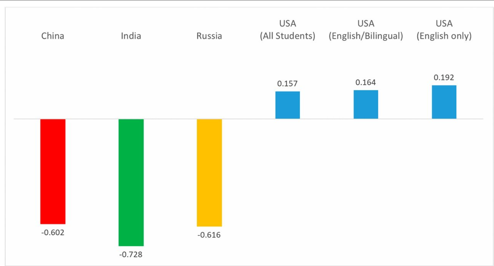
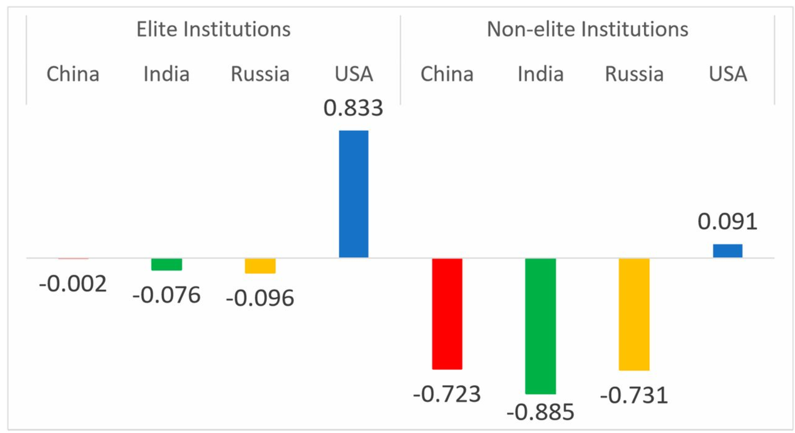
I found a research paper that does a great job of answering this very complex question. The paper is titled “Computer science skills across China, India, Russia, and the United States“; and reports a study that compares industry preparedness of seniors in computer science programs at both elite and non-elite school within Chine, India, Russia, and the United States. The study involved seniors from each school taking a two hour long multiple choice exam, with the following charts detailing the results of the analysis:


CS skills by elite and nonelite institutions: China, India, Russia, and the United States. Within each country, the mean estimate for elite institutions is higher than the mean estimate for nonelite institutions (China, P = 0.063; India, P = 0.174; Russia, P = 0.084; United States, P = 0.000). The mean estimate for elite institutions in China, India, and Russia combined is lower than the mean estimate for elite (ACT/SAT equivalent >1,250; approximately the top quintile) institutions in the United States (P = 0.008). Mean estimates for nonelite institutions in China, India, and Russia are each lower than mean estimate for nonelite institutions in the United States (P = 0.000). Mean estimates for elite institutions across China, India, and Russia are not statistically different (P > 0.100). Mean estimates for nonelite institutions across China, India, and Russia are also not statistically different (P > 0.100). Estimates reported as effect sizes (in SD units). Scaled CS examination scores converted into z-scores using the mean and SD of the entire cross-national sample of examination takers. As such, the overall mean of the standardized score across all four countries is zero. SEs adjusted for clustering at the institution (university/college) level.

CS skills across China, India, Russia, and the United States after adjusting for United States student’s’ self-reported best language. The mean estimate of CS skills among United States students (“All”) is substantively the same as both (i) United States students who reported their best language is English or English and another language equally (English/Bilingual: 94.4% of all sampled United States students); and (ii) United States students who reported their best language is English only (89.1% of all sampled United States students). The mean estimates of CS skills for each of these categories of United States students are higher those of China, India, and Russia (in each case, P = 0.000). Estimates reported as effect sizes (in SD units). Scaled CS examination scores converted into z-scores using the mean and SD of the entire cross-national sample of examination takers. As such, the overall mean of the standardized score across all four countries is zero. SEs adjusted for clustering at the institution (university/college) level.

While the results are somewhat unbelievable, there are several measures the researchers took to ensure strong, unbiased data. To create the test, they used several international standards for question generation, and also took several steps and checks to ensure the tests were translated properly into each country’s main language. They also conducted the exam questions in pseudo-code, to eliminate possible CS language skill barriers. The researchers also took measures to ensure that each student took the exam in a similar environment, and accounted for unmotivated students by removing scores of students who left 25% or more of the test blank. They also examined the data from a number of different angles in order to remove biases that may have existed within the exam. For example, the second chart (above) shows exam results from different categories of US students to account for the possibility that US students out-performed other countries because of substantial recruiting of the strongest CS students from other countries to US programs. This data shows that all US students performed better on the exam, regardless of their language origin.

I also like that the researchers only included the top 4 stem-major producing countries. This allowed them to conduct an intricate study where many different error-correcting measures could be taken. They did not need to work with data from every country, and such a scale of study would have been unmanageable. It was responsible to take a limited data set of the top four contributors to computer science students globally, and acknowledge that this is the case for the data. The researchers also acknowledge the limitations of using a small pool of countries to compare to US schools, especially considering the diversity between the selected countries China, India, Russia, and the US.

Overall I found this paper answered my question, and told me with seemingly reliable data that US computer science programs are indeed preparing their students well, perhaps even better than the international average.

How should you communicate your data?

In class we went over an example of a poorly prepared data chart that had influenced thinking on the subject for a long time, despite being an inaccurate representation of the data. The chart included economic data that tried to show a causational relationship between the amount of product choices available and the performance of that type of product in the market, but ultimately ended up portraying the data in a way that was misleading. In this case, the data had been generalized and organized poorly, and ended up influencing thinking around that subject, despite being wrong. Eventually, some smart people looked at the chart and realized the data didn’t support the original conclusions. The chart was a bar graph with a poorly designed axis system. This example got me thinking about the ways in which we communicate data, and wondering which methods are more dangerous in misrepresenting relationships between variables. How can we communicate data transparently, so that even if our initial interpretations are invalid, others will be able to spot the mistake sooner?

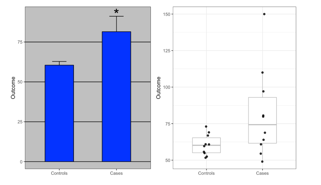
This question lead me to read this article, entitled “Open letter to journal editors: dynamite plots must die”, which is an opinion piece on the nature of data which I think has some interesting points. The author, Rafael Irizarry, argues that ‘dynamite plots’, or bar graphs and line graphs, commonly mis-represent data by obscuring it. These kinds of plots are useful only in visualizing the summary of a data set, but do not offer any other information. He uses the below charts as an example data set that is comparing diastolic blood pressure for patients on a drug and placebo.

The chart on the left is a simple dynamite plot which actually obscures the data set, and focuses only on the final average. According to Irizarry, “The dynamite plot makes it appear as if there is a clear difference between the two groups,” but “Showing the data reveals more information”. He points out that the chart on the right shows much more information about the data set, including that both cases of extreme blood pressure, high and low, actually are in the treatment group. The chart on the left makes the drug look more reliable and effective than the one on the right, which shows a wildly variable effect within the treatment group. In other words, the dynamite plot is misleading, because it obscures the reality of the data, and makes the relationship appear more stable than it actually is.

Overall, this insight has changed the way I will look at data in the future. Dynamite plots are actually just summaries that can be communicated more easily with just a few words. Giving readers access to the full dataset is the more responsible option, because it allows conclusions to be double checked continuously. I wonder if a more transparent infographic would have had different results in the economic chart I talked about originally? I am having trouble finding that chart again on the internet or class website, but I remember from class that it was a simple bar graph with a poorly organized x-axis. While a simple re-ordering of data entries might have done the same, I believe a more transparent representation of the data would have helped readers and interpreters catch the mistakes of the graph sooner.

Is Red Meat Bad for You?

Many of my friends and family have been switching to a red meat free diet. Generally, they seem to support this decision through either prospective environmental benefits, or health benefits. The environmental benefits are well supported, as the meat industry clearly produces a heavy carbon footprint. With regards to the health benefits, anecdotally I have heard many people claim that they “feel better” after cutting red meat from their diet; but this is not enough to prove red meat is unhealthy. I want to know: Is red meat considered a healthy food option?

To find out, I followed the standard procedure in answering any generic question in the modern age: I googled it. This grueling methodological process led me to an article entitled “Is Red Meat Bad for You, or Good? An Objective Look” from a website called HealthLine. This articles attempts to answer the question that is its namesake by providing lots of data from three different categories: Distinctions between kinds of meat, nutritional data of the average red meat portion, and data from studies concerning red meat’s links to diseases like cancer, diabetes, and heart disease. The article uses these three data sets by considering the data about types of meat to assist in analysis of studies that argue red meat is unhealthy, and then weighing that analysis against the raw nutritional benefits of red meat. Through this data, the articles provides a compelling study driven argument that “there is no strong evidence linking red meat to disease in humans” and that “properly cooked red meat is likely very healthy”.

The article explains the key differences between types of red meat, including the risks and benefits associated with them. This includes processed meat, conventional red meat, and grass-fed, organic meat. The article then asserts that these differences are vital in comparing studies that concern the health benefits/risks of red meat, since these categories each have different proven nutritional compositions. This is a responsible framework to set up for analyzing the data from different studies, because it acknowledges that “red meat” is a broad category and should be broken up into smaller, more measurable pieces. It also introduces an important metric of quality to the question at hand.

The article then details the known nutritional benefits of red meat. This is helpful data because when determining if a food is healthy, the nutritional facts are vital. This is also helpful because many studies are trying to prove that red meat is unhealthy. We need to be able to weigh the risks determined in those studies appropriately against the known benefits in order to successfully answer the question at hand.

The article then cites numerous scientific studies as data both in support of and against red meat. The article assesses the credibility of studies linking red meat consumption to various diseases, and determines that because they are observational studies, they are not conclusive. It then proposes that randomized controlled trial based studies would be more conclusive, because they contain less margin for confounding factors. While the observational studies established a correlation between red meat consumption, the randomized controlled trials did not.

By looking for more reliably unbiased data, and by including additional metrics for evaluating that data, this article answers the question of whether or not red meat is healthy in a logical and transparent way. Each data source is cited and linked, which makes the argument more reliable as well.

What Major Will Make Me Happy?

Choosing a major is the hardest part of college. Despite everyone repeatedly telling you that your major does not definitively define your career, the process feels none the less scary. It’s a big commitment, and there is a lot of societal pressure to have your dreams hashed out as quickly and in as much detail as possible. There is a lot of advice out there for choosing your major. The list includes predicted job security, income, employment rate, overall satisfaction, personality compatibility and more. In the end, it is up to the individual which metric they want to use, as well as what field they are most interested in. However, for people who find themselves good at most things yet passionate about nothing, choosing a major is the most difficult question out there. My question pertains to the hardest metric to gauge in choosing your major; which option is likely to keep me happy in the long run?

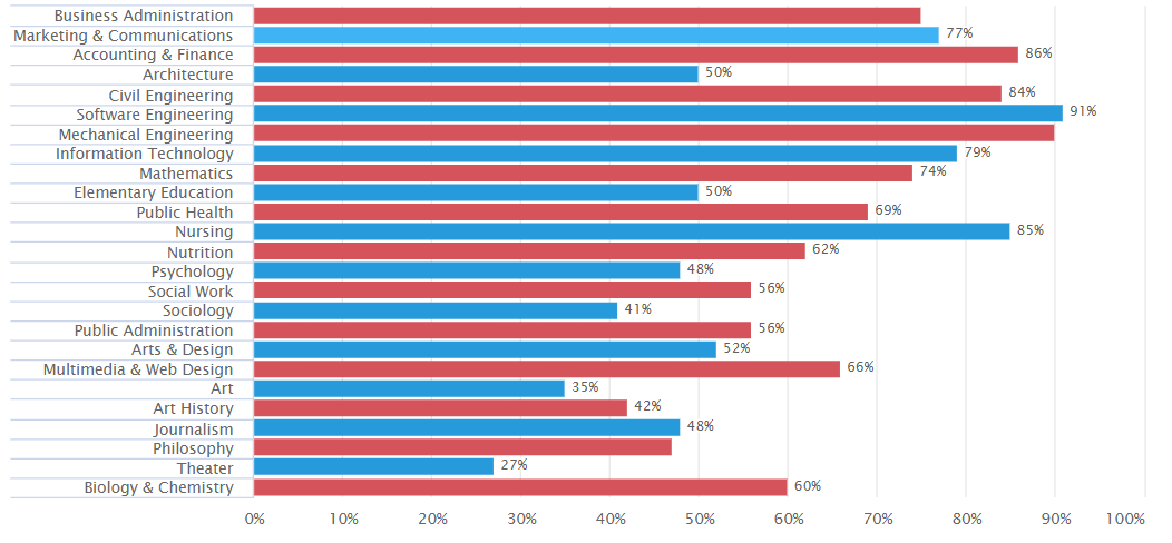
A quick google search of this question leads you directly to this article from bestcolleges.com. While this article has lots of information pertaining to the metrics listed above, the chart I want to focus in is titled “Happiest Majors” about half way down the page. Below is the chart from the page, which takes the 25 most popular undergraduate majors and rates their recommendation levels from degree holders. The X axis represents the amount of degree-holding alumni who recommended pursuing each degree.

While the article argues that this table is an accurate metric for overall happiness with a major, I would argue that this data does not fully support that conclusion. The data answers a different question than was asked. If I want to know which college major will make me happy, asking degree holders if they recommend pursuing their own major might not be the best way to measure it. Whether or not a person recommends their major or field of study is independent of how happy that field makes them. They could be correlated, but many people choose fields for reasons besides happiness. They could also be recommending their field for monetary reasons for example. A better question might be to ask degree holders of each specific major whether or not they are happy with their choice, rather than give a recommendation as to whether or not it is a good idea. This question would provide us with better data, because it actually mentions happiness, the metric we are trying to gauge. Because happiness is so difficult to measure, subjective-experience based data is a good strategy. While recommendations may hint towards happiness levels of different fields, it is likely that they are heavily influenced by other factors.

Another issue with this data is the lack of context. Because very little is described about the data, it is likely being manipulated to make certain fields seem more attractive. The rest of the charts on this site, as well as this one, seem to have a clear bias against social sciences, arts, and humanities, while at the same time over-recommending STEM and business fields. The lack of context to the data is evidence for this bias. For example, the article never states that each line on the chart represents recommendation levels from people who graduated with that specific major. The only context given is that this data was gathered from degree holding alumni. This does not necessarily mean that the degree holder had a degree in the field they are either recommending or discounting. This lack of context makes it easier for the article to come to the conclusion that business and STEM fields will make you happier, without necessarily having to backup the claim.

For these reasons, I do not believe this article answered the question as to which college major will help a prospective student be happy. Admittedly this is a very hard question to answer, but you should not claim to answer it without sufficiently clear data. I believe that the conclusions made by this article are not fully supported by the data it provides, and that those conclusions are thus clearly influenced by bias towards STEM and business fields.

You Won’t Believe What This Post is About!

Despite the apparent lack of information pertaining to the content of this post, the title actually does describe what I want to talk about. The internet is plagued with titled links congruent to mine. What I want to explore is whether or not clickbait such as these are successful strategies in promoting content, and if so, which bait catches the most fish? I want to know what factors decide how likely I am to click on something, and what decisions are made in society to profit off of that information.

Clickbait is an extreme consequence of effective headlining. For a normal article, the title needs to be concise and enticing. You need to communicate the promise of your piece, and inform potential readers what they could be in for. Clickbait follows the same guidelines for titles, but the actual content is often more vacuous and less interesting than it was previously made out to be. Clickbait that fails to deliver in content is by far the most unsatisfying, however studies and market values agree that when used effectively, it can be an excellent way to promote and viralize your content. For the purposes of this discussion, the term ‘clickbait’ will refer to articles with titles designed specifically to maximize the amount of visitors to the content, and to see if this is a successful strategy in marketing said content.

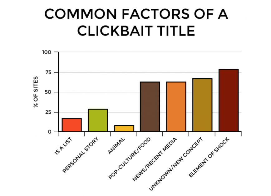
Clickbait titles often employ strategies like mystery, shock factor, and emotional appeal to goad you into clicking. “Find out more”, “You won’t believe”, “Which _____ are you most like”, “The shocking truth behind ____” are all common formulas to get you curious about what’s packaged underneath the title. The chart below shows common attributes of online titles that have been identified as ‘clickbait’. Most of these categories fit in the lines of something that either picks at your curiosity, or something that is designed to feel personable.

Clickbait has success stories as well as horrible failure stories. Perhaps the most famous media outlet focused around the idea is BuzzFeed, which has a remarkably high success rate from articles titles in a clickbait fashion. In fact they use it so successfully that they were even able to write a clickbait article about buzzfeed clickbait articles.

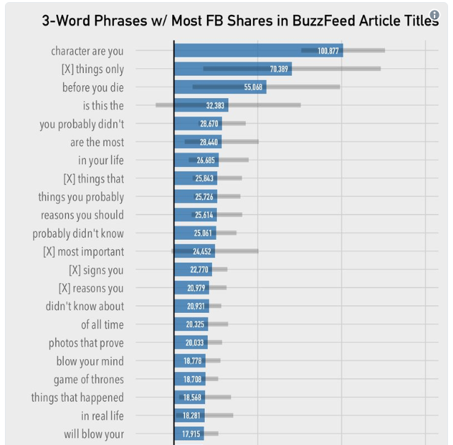
That article is focused around the following chart (sort of), which shows BuzzFeeds most successful clickbaiting phrases. The chart highlights appeals that are most likely to cause clicks. The first and third top phrases, for example, both appeal heavily to emotion; the first likening a reader to a character (probably one they like) and the next expressing the urgency of mortality. If someone tells you to do something before you die, chances are you might be inclined to listen, and it is that emotional appeal that this phrase employs.

While BuzzFeed is able to employ this marketing tactic to their advantage, many experts warn against clickbaiting for any outlet focused on producing more serious content. In his Time article entitled “What You Think You Know About the Web Is Wrong” CEO of Chartbeat Tony Haile describes the issue, ” chartbeat looked at deep user behavior across 2 billion visits across the web over the course of a month and found that most people who click don’t read. In fact, a stunning 55% spent fewer than 15 seconds actively on a page.” 15 seconds is definitely not enough time to get a serious point across, however it is roughly enough time to get a solid grasp on the Buzzfeed meta-Buzzfeed article talked about previously in this post. It comes down to what audience you are targeting, or if visitation numbers is more important to your business model than content propagation. According to Haile, capturing attention for shorter periods of time makes your users much less likely to return. So a 15 second use time is incredibly unlikely to result in a returning user, while a 3 minute one is much more likely to do so. I would argue that this reason is why sites like BuzzFeed use nested clickbaits; where the entire article contains links to more and more clickbait articles “you might enjoy”. If they can grab your attention for longer periods of time, you are more likely to come back. Considering this information, BuzzFeed’s content strategy is well structured around clickbait. Their articles take 30 seconds to read, and provide you with numerous paths to new ones.

Within society the general notion is that clickbait is bad. People don’t like it, and this is proven simply by the cautious name of ‘clickbait’. Being baited into anything is usually considered a negative, like a fish to a hook. From what I read on this topic, clickbait is generally considered a bad marketing strategy, however it can be used extremely effectively. As societal outcry against clickbait increases it becomes less viable. For example Facebook and Google, the two largest content surfing platforms on the web, both take extensive measures in preventing spam / clickbait titles from appearing heavily on their platforms (although neither is successful at preventing it).

Resources:

Haile, Tony. “What You Think You Know About the Web Is Wrong.” TIME, TIME, 9 Mar. 2014.

Khoja, Nadya. “7 Reasons Why Clicking This Title Will Prove Why You Clicked This Title.” Venngage, Nadya Khoja, 23 Feb. 2016, venngage.com/blog/7-reasons-why-clicking-this-title-will-prove-why-you-clicked-this-title/.

Phillips, Tom. “13 BuzzFeed Headlines that Should Really Exist.” BuzzFeed, BuzzFeed, 13 Jan. 2015.