In class we went over an example of a poorly prepared data chart that had influenced thinking on the subject for a long time, despite being an inaccurate representation of the data. The chart included economic data that tried to show a causational relationship between the amount of product choices available and the performance of that type of product in the market, but ultimately ended up portraying the data in a way that was misleading. In this case, the data had been generalized and organized poorly, and ended up influencing thinking around that subject, despite being wrong. Eventually, some smart people looked at the chart and realized the data didn’t support the original conclusions. The chart was a bar graph with a poorly designed axis system. This example got me thinking about the ways in which we communicate data, and wondering which methods are more dangerous in misrepresenting relationships between variables. How can we communicate data transparently, so that even if our initial interpretations are invalid, others will be able to spot the mistake sooner?
This question lead me to read this article, entitled “Open letter to journal editors: dynamite plots must die”, which is an opinion piece on the nature of data which I think has some interesting points. The author, Rafael Irizarry, argues that ‘dynamite plots’, or bar graphs and line graphs, commonly mis-represent data by obscuring it. These kinds of plots are useful only in visualizing the summary of a data set, but do not offer any other information. He uses the below charts as an example data set that is comparing diastolic blood pressure for patients on a drug and placebo.
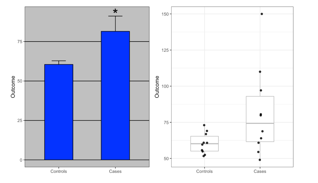
The chart on the left is a simple dynamite plot which actually obscures the data set, and focuses only on the final average. According to Irizarry, “The dynamite plot makes it appear as if there is a clear difference between the two groups,” but “Showing the data reveals more information”. He points out that the chart on the right shows much more information about the data set, including that both cases of extreme blood pressure, high and low, actually are in the treatment group. The chart on the left makes the drug look more reliable and effective than the one on the right, which shows a wildly variable effect within the treatment group. In other words, the dynamite plot is misleading, because it obscures the reality of the data, and makes the relationship appear more stable than it actually is.
Overall, this insight has changed the way I will look at data in the future. Dynamite plots are actually just summaries that can be communicated more easily with just a few words. Giving readers access to the full dataset is the more responsible option, because it allows conclusions to be double checked continuously. I wonder if a more transparent infographic would have had different results in the economic chart I talked about originally? I am having trouble finding that chart again on the internet or class website, but I remember from class that it was a simple bar graph with a poorly organized x-axis. While a simple re-ordering of data entries might have done the same, I believe a more transparent representation of the data would have helped readers and interpreters catch the mistakes of the graph sooner.
